Designing a Currency Converter for Travel
Role
UX Designer
Responsibilities
Competetive Analysis, User Research, User Testing, Wireframing, Prototyping
Team
Solo
Timeline
4 weeks (2024)
"Why are all currency converters full of ads - and useless without internet access when I'm travelling?"
Why make a currency converter just for travel?
You don't want to spend your time travelling on converting prices. Most available currency-converter apps feel like obstacle courses: you tap Convert, only to be halted by pop-up ads or not have access to the exchange rate when you lose service. This leads to frustration, guesswork and lost time that could have been otherwise been used to do something much more rewarding.
As part of the Google UX Design Certificate course I decided to tackle this problem to make travel more enjoyable.
Understanding users and taking a look at the competition
Designing for young, frequent travellers
My primary audience are 20 to 35 year old travellers who hop on flights every few months. They value quick access to information over deep financial data and expect availability even in areas with spotty network access. They just want to know if the souvenir is EUR 20 or EUR 22 - it's not very complicated. Therefore, I deprioritized detailed currency exchange rates in favour of simplicity and efficiency.
After conducting multiple one-on-one interview, I identified three primary pain points:
Cluttered Interfaces
Many existing apps feature outdated layouts and display unnecessary data, overwhelming users.
Lack of Offline Functionality
Users can't convert currencies when they lose internet connectivity or have poor coverage.
Disruptive Ads
Frequent pop-ups and unskippable ads slow down use and frustrate users.
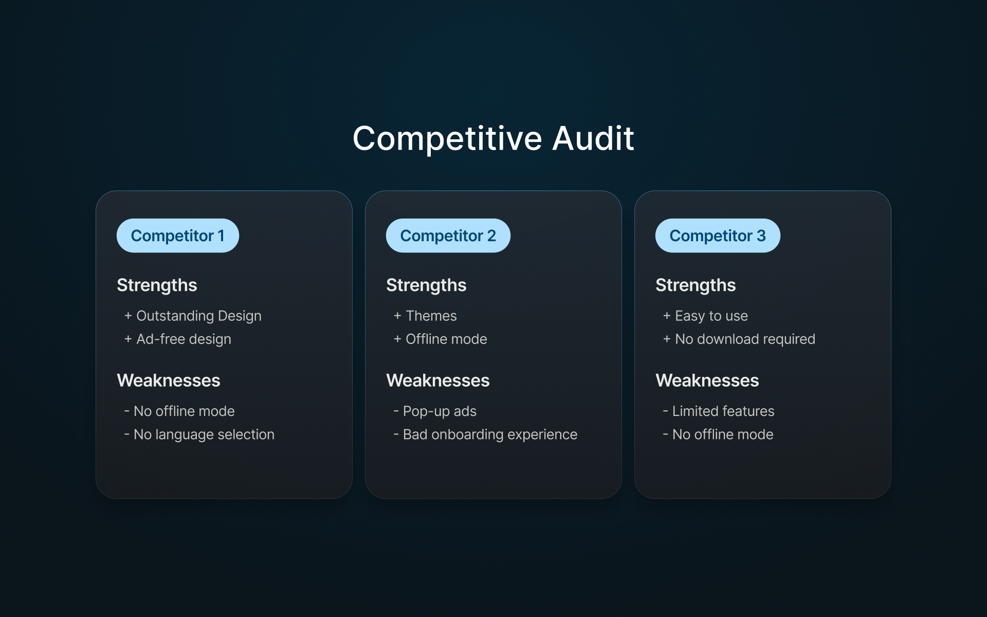
Competitive Audit: Potential for Improvement
I reviewed nine popular apps to document common patterns, strengths, and weaknesses. Most are littered with pop-up ads and lack offline functionality. They have a cluttered, complex design that slows the user's experience. A few offer web-apps that don't require downloads, which can be very convenient—but none combine all the features travellers need.
Documenting my design process
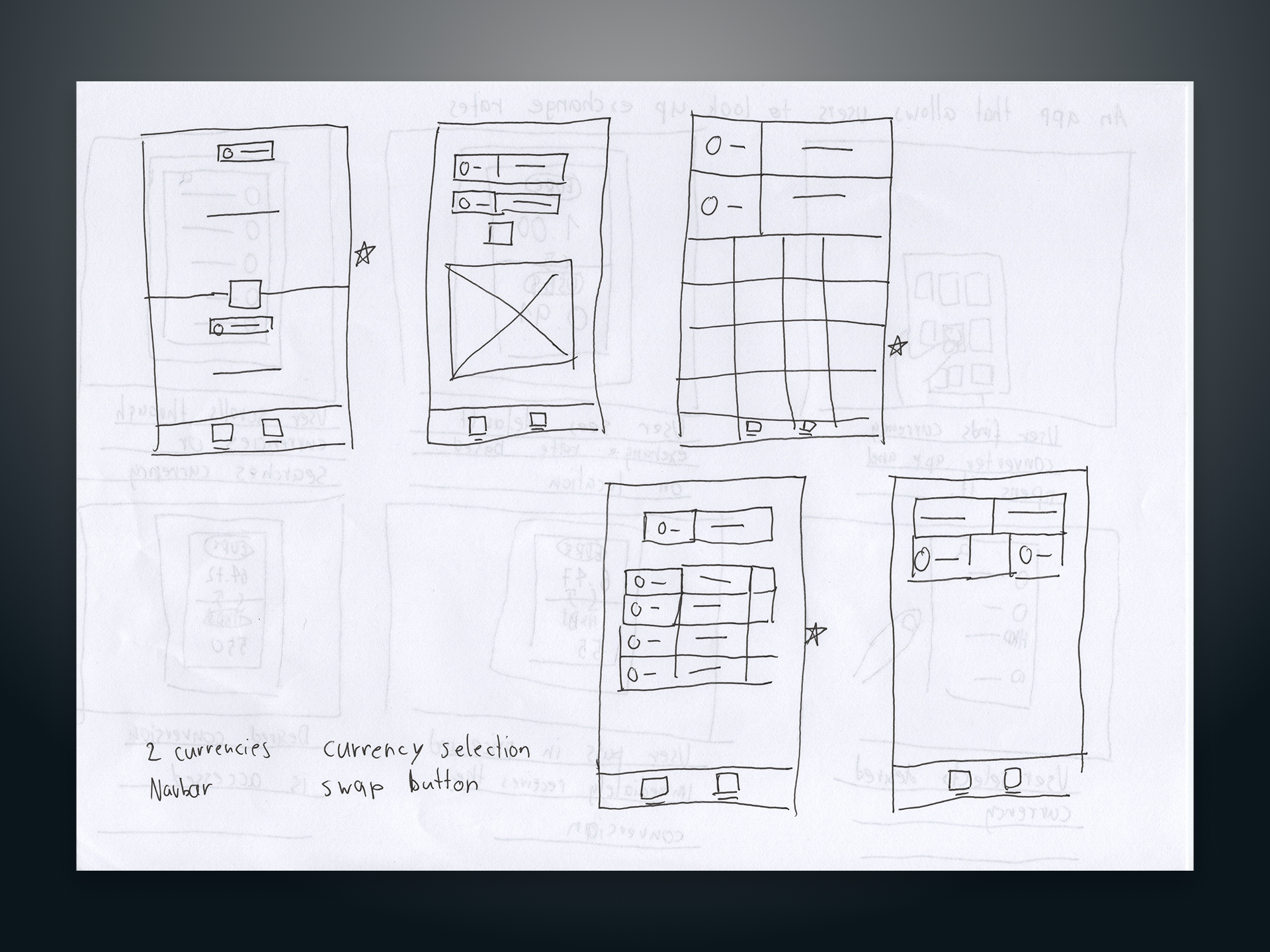
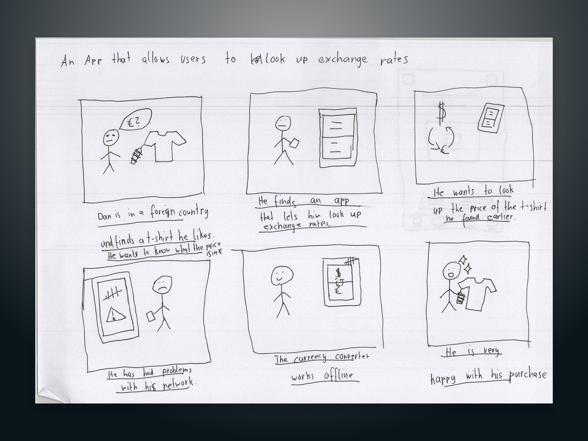
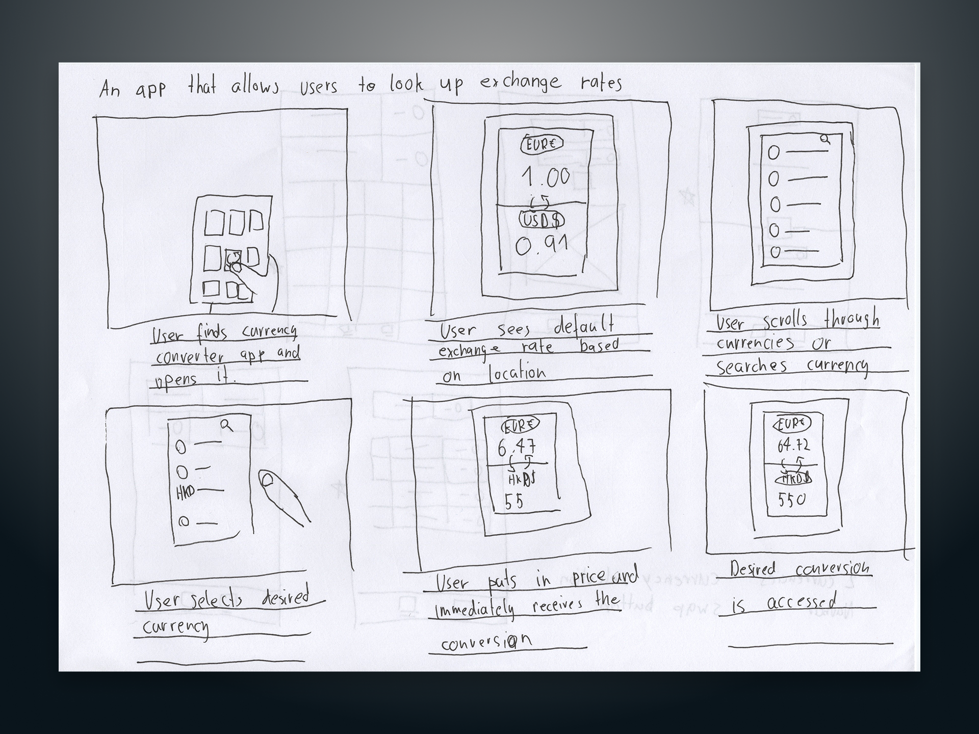
Sketching, Wireframes and Storyboards
I started by sketching some paper wireframes that focus on minimizing steps from input to conversion and created storyboards to better understand the real-world usage contexts. I marked compelling aspects from the wireframes with stars to later translate them into Figma wireframes.
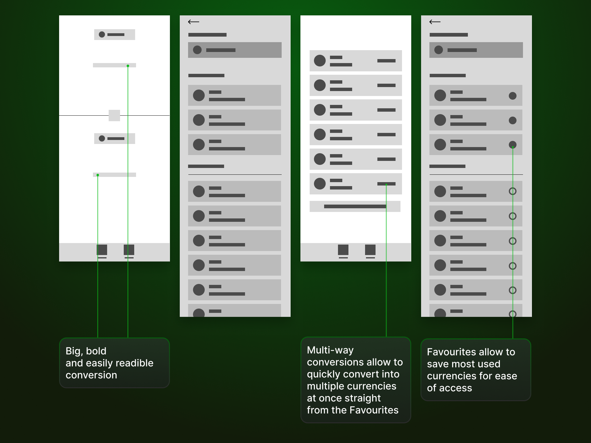
Creating digital wireframes and lofi prototypes
I translated my paper wireframes into Figma and established the fundamental look and feel I was going for.
Key Usability Insights & Solutions
After converting the wireframes into a low-fidelity prototype, I conducted usability studies to find potential problems early on.
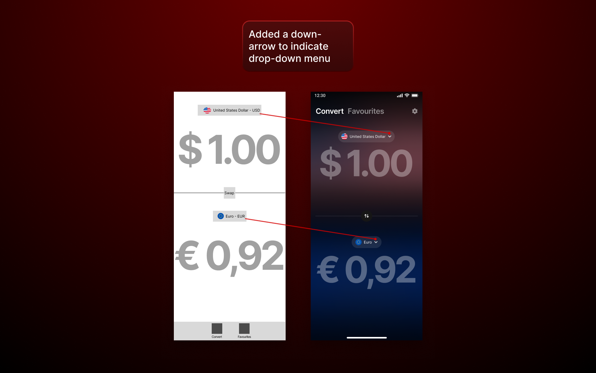
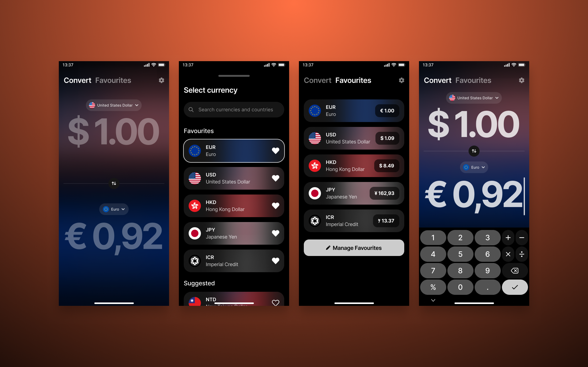
- Currency selection: Some users weren't sure how to swap or choose currencies.
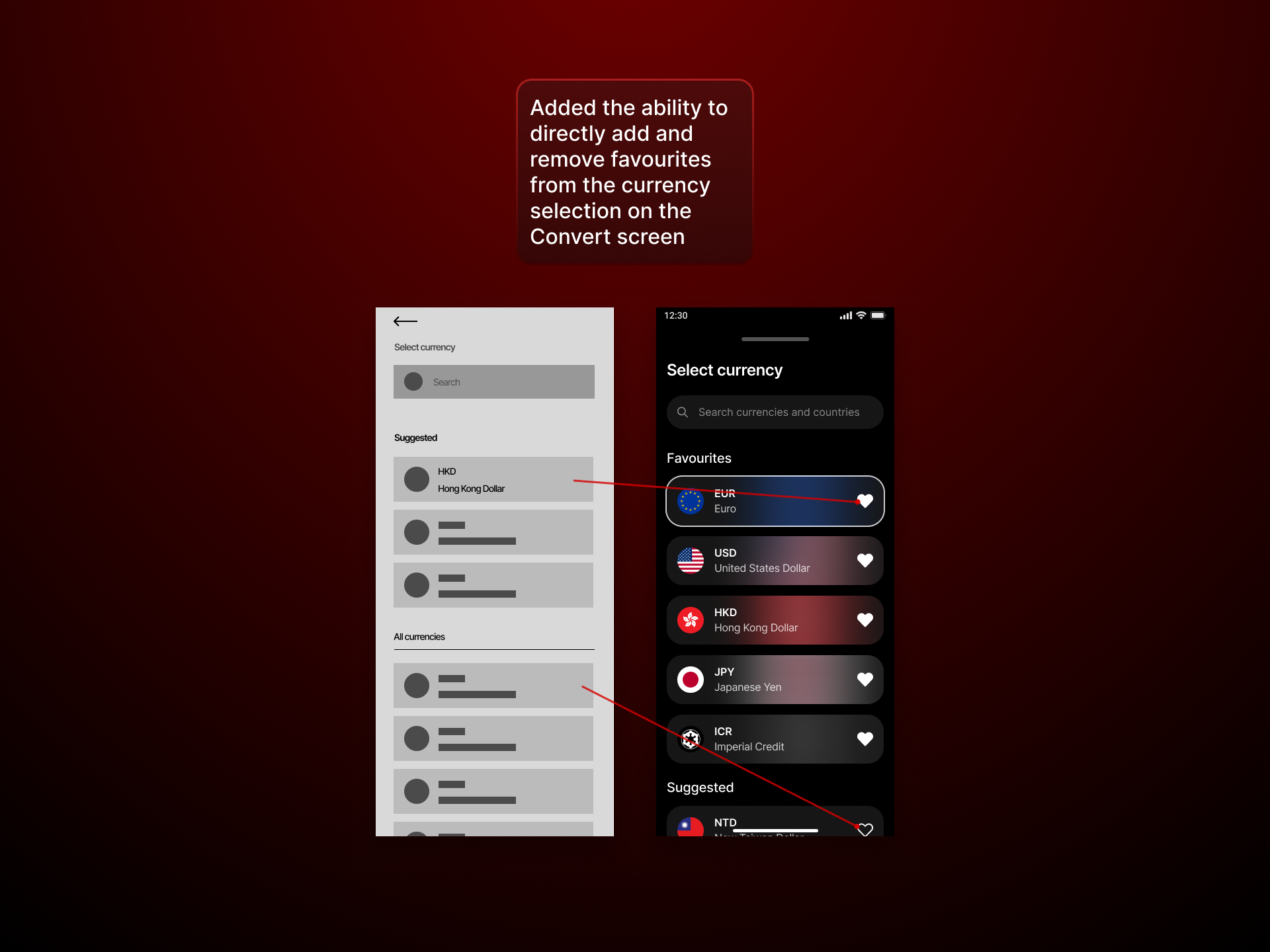
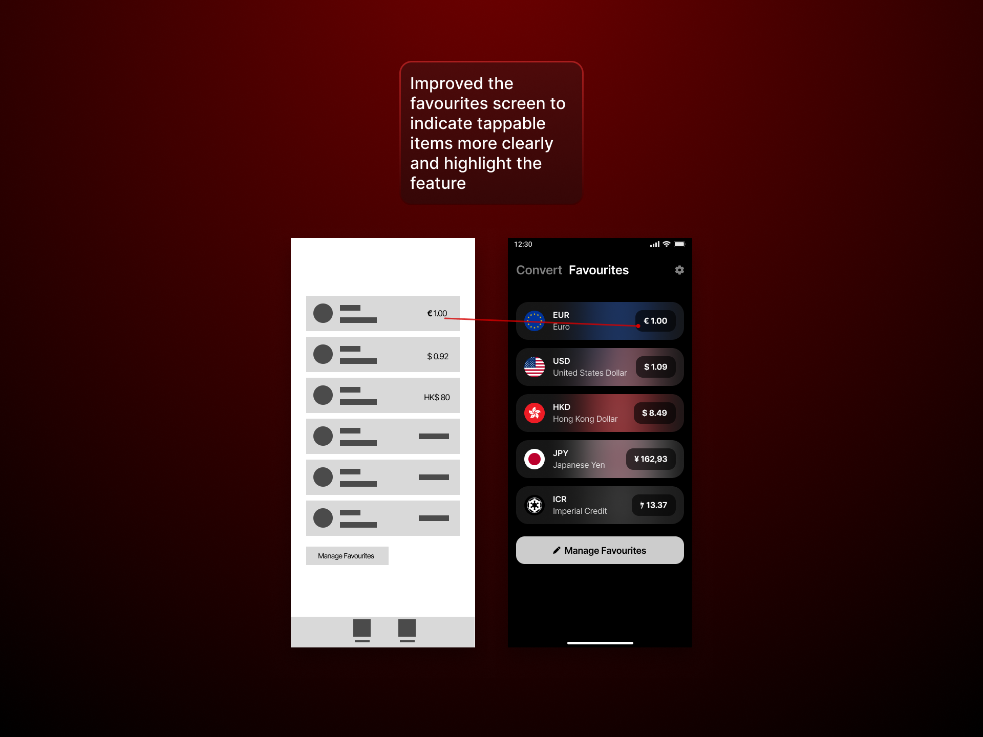
- Managing favourites: Participants wanted a direct way to add and remove favourites from the currency selection screen.
- Multi-way conversion: Most users didn't understand that a multi-way conversion was possible from the favourites screen.
I iterated on my designs based on these findings by fleshing out the frames and adding clearer affordances and multiple options for the user to get a desired action done.
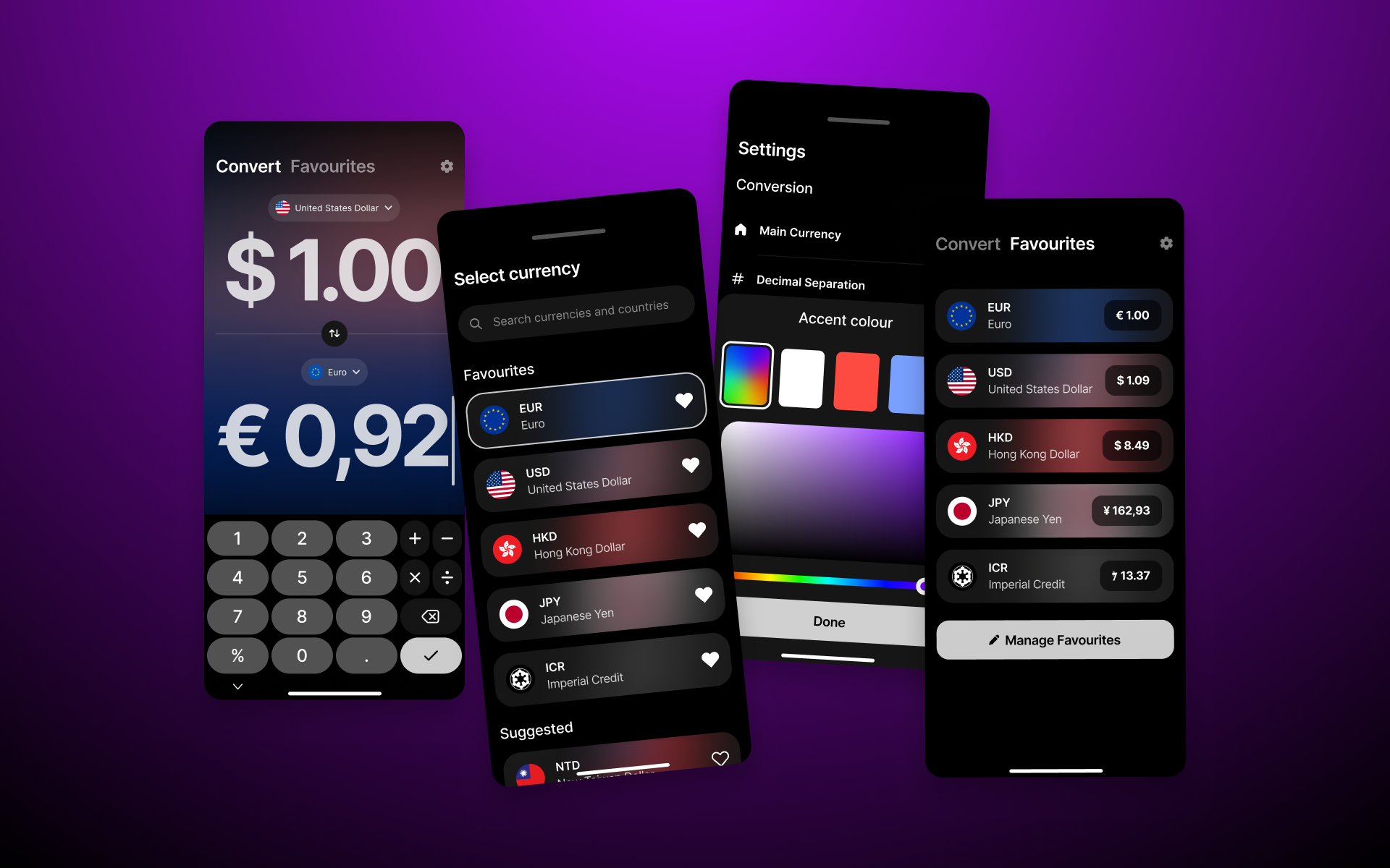
Final Design spotlight
 Interact with the full prototype in Figma
- Big and bold conversion screen allows for better readability and makes situations easier where you would want to show a conversion to a friend for example.
- Built in calculator in keyboard to do simple calculations when purchasing multiple things or sharing a bill.
- Offline mode is automatically available, the last updated rate is locally saved and a small message appears that the most current rate is not available right now because of a missing network connection.
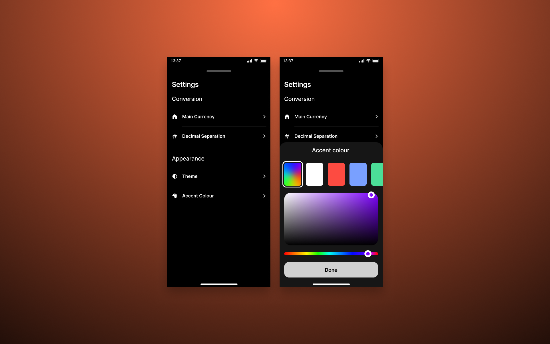
- Themes allow customization of the accent colour to the user's liking.
Lessons learned
A deep competitive audit isn't optional - it's the foundation for quick, user centered decisions, especially when you are not inventing something new. User interviews and usability studies helped me to focus on what works and iron out stumbling blocks in the early stages of the design process.
Closing Reflections
Working solo once again taught me the importance of structured feedback loops. I especially enjoyed the early brainstorming phases, where I was able to get all the ideas out of my head and onto paper and then experiment with the aspects that might work well. I'll definitely be integrating these systems more in future projects to provide an even more user centered experience.